Is It Too Much? Cosmic Orange iPhone 17 Pro Unboxing & Impressions!
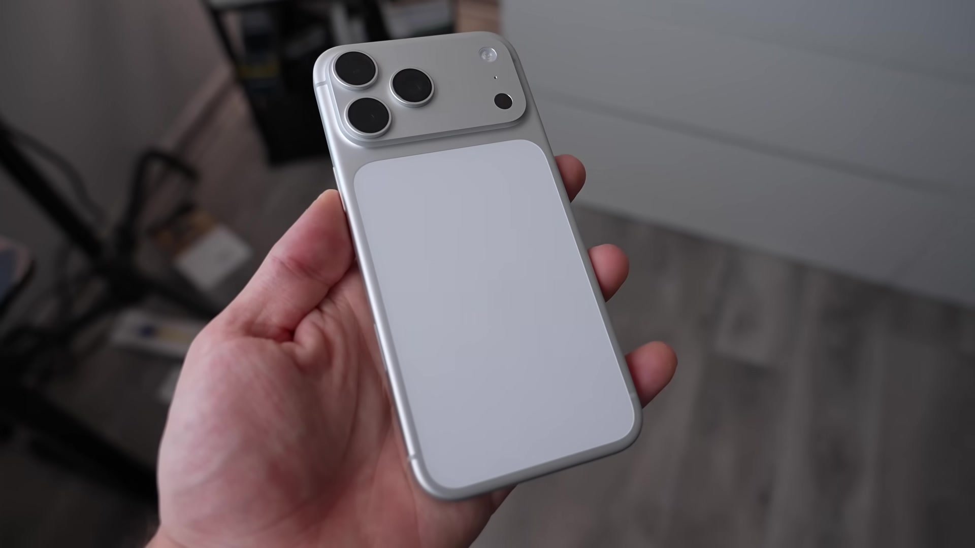
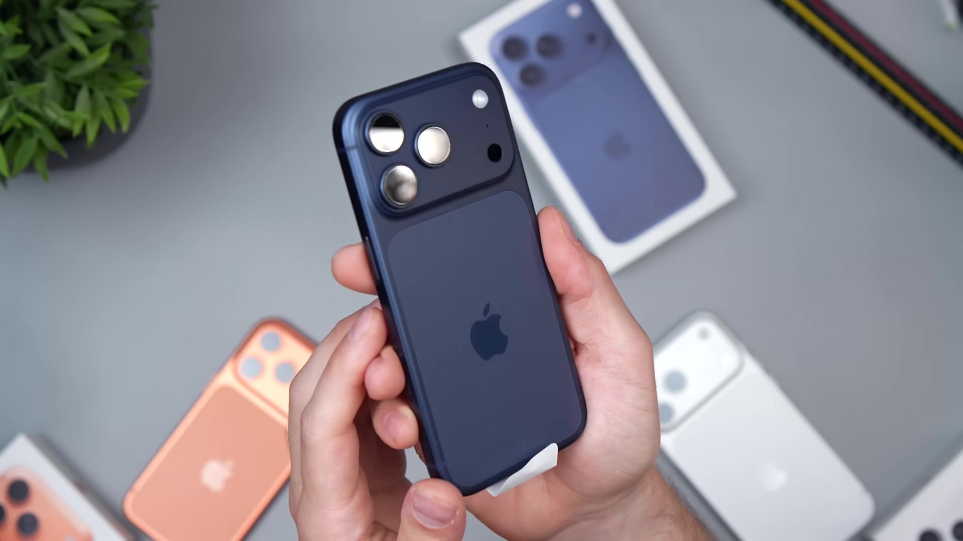
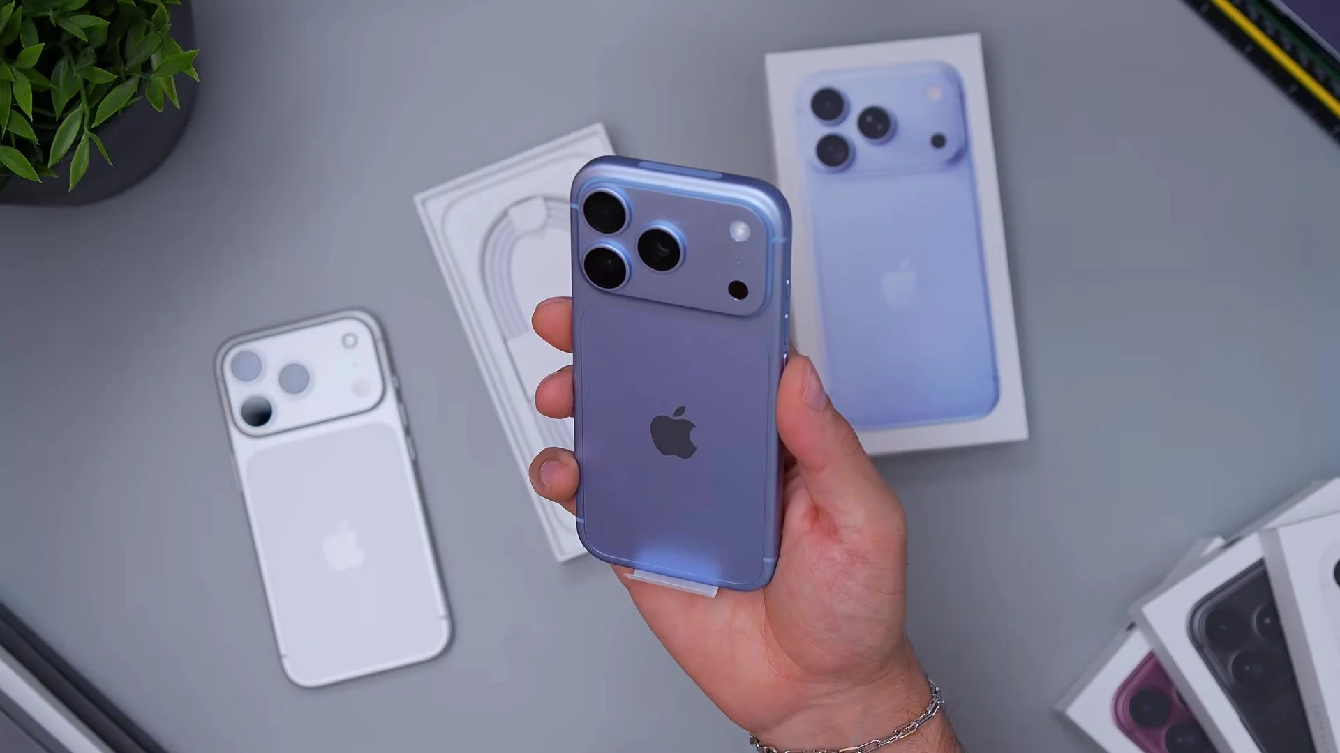
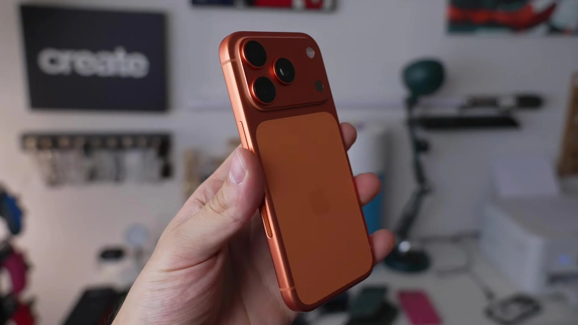
Cosmic Orange on the iPhone 17 Pro is bold in a way Apple doesn’t usually ship — and in person it might be too much for some people. On camera it reads warmer and more metallic than the product page, which is exactly why I wanted a full unboxing before calling it. I pulled the Cosmic Orange Pro out of the box, compared it next to Silver and Deep Blue on the desk, and shared honest first impressions for anyone deciding whether this loud finish is the one to buy.
Who Cosmic Orange is perfect for — and who should skip it. My Honest Take: Cosmic Orange isn’t subtle and it isn’t “safe.” It’s a saturated copper-orange that pops under studio lights and still looks intentional in daylight. If you want a Pro that doesnt disappear into every case rotation, this is the statement pick. If you prefer stealth or cleaner desks, Silver or Deep Blue will feel smarter day to day. The surprise is how premium the metal rails look once you’re past the shock of the color.
Watch the Full Breakdown — Watch the full Cosmic Orange unboxing and impressions. Final Thoughts: Cosmic Orange is the “is it too much?” color in the iPhone 17 Pro set — and for the right person, that question is the point. Confirm with real footage before you order; oranges shift a lot between Apple’s site and your actual lighting.